Here's an article that's a must-read for anyone interested in building better places in our communities. Density is not the answer, Place to Non-Place ratio is.
Places and Non-Places
Sunday, October 19, 2014

Tuesday, August 19, 2014
A new development built in the traditional style!
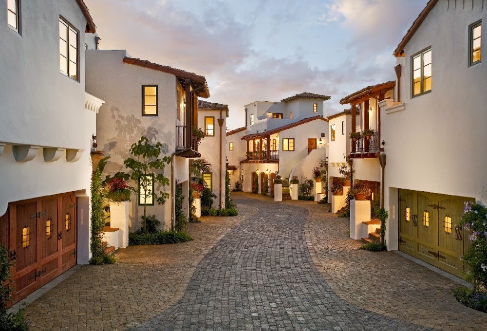
Sure, it's located in the midst of the sprawliness of outer Santa Barbara, but it's a start! Las Palmas Viejas is a small development of several "villas" off a highway west of downtown Santa Barbara. The designers involved in this project did a fine job incorporating garage doors & an even better job at the design of the "street" (which is effectively a cul-de-sac). Notice how there is no separation of sidewalk and roadbed. A change in paving stone colour does the same job while refusing to distinguish clearly separate spaces for cars and walkers, thus calming traffic.
Even at such a small scale, it's encouraging to see developers willing to try this type of project instead of typical suburban housing or superblock "townhomes."
Friday, June 27, 2014
A Look at Boone (Part 2: King Street)
King Street is Boone's primary commercial strip, and is one of the top "main streets" in North Carolina. For a half-mile the street is lined with numerous shops and restaurants. Even though it attracts a good amount of foot traffic, the sidewalk is wide enough that there is never a feeling of being jammed between the buildings and the parking lane. At times the sidewalk is arcaded, which is a plus on wet days.
View Larger Map
However (there's always a "however," isn't there?)... King Street's bipolar personality of walkable main street and major thoroughfare is detrimental. For example, the vehicular right-of-way is wide to the point that crossing is rather uncomfortable. Though the speed limit is low enough that you don't have to play human Frogger while trying to cross (like too many streets), King Street gets enough traffic to act as a barrier to businesses on the other side. The number of parking areas on the southern side (the right side in the picture) also kills the streetwall effect and most people prefer to walk on the other side.
Overall, King Street is solid by North Carolina standards but possesses way too many characteristics of modernistic, post-car urban design.
View Larger Map
However (there's always a "however," isn't there?)... King Street's bipolar personality of walkable main street and major thoroughfare is detrimental. For example, the vehicular right-of-way is wide to the point that crossing is rather uncomfortable. Though the speed limit is low enough that you don't have to play human Frogger while trying to cross (like too many streets), King Street gets enough traffic to act as a barrier to businesses on the other side. The number of parking areas on the southern side (the right side in the picture) also kills the streetwall effect and most people prefer to walk on the other side.
Overall, King Street is solid by North Carolina standards but possesses way too many characteristics of modernistic, post-car urban design.
Thursday, June 5, 2014
Appalachian Urbanity? A Look at Boone (Part 1: The Campus)
I recently visited Boone, North Carolina. This will be the first in a short series of posts inspired by and/or about the town (considered by some the best in the state).
Boone is well known for its natural beauty and being the home of Appalachian State University. We will get to the rest of the town some other time, but today I'll be focused specifically on ASU and its campus layout.
Like many universities, Appalachian State is laid out in a format that is somewhat reminiscent of a traditional city. A cluster of buildings connected by narrow pathways surrounds a central open space. App State's central meeting area is known as Sanford Mall. Of course, being a fairly new campus, a lot of design features are influenced by mistakes that modern cities have made in the last century.
Here is what the campus looks like from above...

The main part of the campus is framed by Hardin Street on the east side, Rivers Street on the south and King Street (Boone's main street) on the north. These major roadways (marked in purple) are essentially barriers to foot traffic and are a pain to cross, so I used them as a border separating the main part of campus from the rest of App State and Boone. The area we are looking at is 0.5 mile by 0.3 mile in size. Durham Park is outlined in green, and building footprints are marked in red.
The most prominent difference between the campus and a true traditional city layout is the huge amount of "green space." No, I'm not talking about the beautiful geographic features the Boone area is blessed with... I'm talking about stuff like this:
View Larger Map
Pointless green space is everywhere. We're not talking about a park. We're sitting here talking about green space, not a park... "green space."
Of course, pointless green space like this is merely a symptom of a larger design mistake. Why do we need all this green space? The architecture of the campus is mammothly scaled, and unfriendly at human eye level. (It's kind of ugly, too.) Green space makes the scene at least a little more visually appealing to people walking around.
View Larger Map
The huge amount of green space needed to neutralise the massive buildings also hurts the walkability of the campus. Desire lines like this are all over the place:
View Larger Map
Don't get me wrong, App State has a pretty nice campus. But as a result of some of these mistakes in scale and basic layout, the area is much more spread out and walking-unfriendly than it needs to be. Appalachian State is (yet another) example of a centrally designed carfree place that unfortunately retains a variety of mistakes that originate in car-centric planning.
Boone is well known for its natural beauty and being the home of Appalachian State University. We will get to the rest of the town some other time, but today I'll be focused specifically on ASU and its campus layout.
Like many universities, Appalachian State is laid out in a format that is somewhat reminiscent of a traditional city. A cluster of buildings connected by narrow pathways surrounds a central open space. App State's central meeting area is known as Sanford Mall. Of course, being a fairly new campus, a lot of design features are influenced by mistakes that modern cities have made in the last century.
Here is what the campus looks like from above...
The main part of the campus is framed by Hardin Street on the east side, Rivers Street on the south and King Street (Boone's main street) on the north. These major roadways (marked in purple) are essentially barriers to foot traffic and are a pain to cross, so I used them as a border separating the main part of campus from the rest of App State and Boone. The area we are looking at is 0.5 mile by 0.3 mile in size. Durham Park is outlined in green, and building footprints are marked in red.
The most prominent difference between the campus and a true traditional city layout is the huge amount of "green space." No, I'm not talking about the beautiful geographic features the Boone area is blessed with... I'm talking about stuff like this:
View Larger Map
Pointless green space is everywhere. We're not talking about a park. We're sitting here talking about green space, not a park... "green space."
Of course, pointless green space like this is merely a symptom of a larger design mistake. Why do we need all this green space? The architecture of the campus is mammothly scaled, and unfriendly at human eye level. (It's kind of ugly, too.) Green space makes the scene at least a little more visually appealing to people walking around.
View Larger Map
The huge amount of green space needed to neutralise the massive buildings also hurts the walkability of the campus. Desire lines like this are all over the place:
View Larger Map
Don't get me wrong, App State has a pretty nice campus. But as a result of some of these mistakes in scale and basic layout, the area is much more spread out and walking-unfriendly than it needs to be. Appalachian State is (yet another) example of a centrally designed carfree place that unfortunately retains a variety of mistakes that originate in car-centric planning.
Thursday, May 1, 2014
Recommended reading: The "narrow" street: narrow for whom?
This is a fantastic post over at Urban kchoze that goes deep into the topic of optimal street width. I especially liked this little bit:
Let's think of some ideas for a better way to describe a human-centric street!
"... [a] human being is about half a meter wide ... a car on the other hand is on average 1,8-meter wide. Compacts are a bit narrower and SUVs are larger. So when we call [these types of streets] a "narrow" street, we still judge the street from the point of view of car drivers, not of pedestrians. So I think we ought to find a better name for them: a right-sized street, or an human-scale street, or some other term."
Let's think of some ideas for a better way to describe a human-centric street!
Subscribe to:
Posts (Atom)